
By Claudia Ostrop
Color Pairing – Find the Perfect Color Combination for Your Project
The thrill of a new project is always inspiring, but deciding which colors go together can be surprisingly challenging.

Colors can be quite overwhelming. It’s sometimes difficult enough to choose a single color for a project, but things can get even trickier if you want to knit or crochet something multicolored.
Working with multiple shades can lead to a loud and vibrant result, or instead to a subtle tone-on-tone look or very soft contrasts.
That’s the topic of this blog post: color pairing – the art of combining colors.
We’ll look at how to combine colors, why some shades naturally harmonize with each other, and reassure you that you are absolutely free to break any so-called “rules” of color if you wish!
How Colors Make an Impact
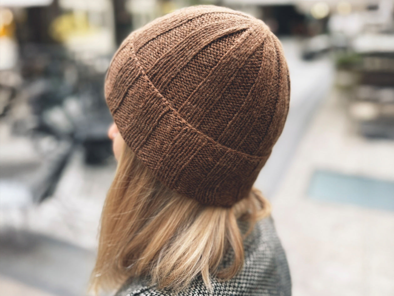
A scarf in plain gray can look very elegant – but maybe a little boring. Add a few yellow accents to it, and suddenly it looks completely different. Colors create moods and evoke associations.

Red is the ultimate attention grabber. In a bright red sweater, you certainly won’t go unnoticed.
Blue evokes sky and water. It usually radiates calmness and clarity.
Green represents nature. Most shades of green feel soothing and relaxing.
Yellow is the color of the sun and radiates cheerfulness.
White feels cool and clear, always carrying a sense of lightness.
Black always has weight. Serious, sometimes oppressive, but also very elegant.
And then, of course, there are all the basic colors in endless shades and nuances—or mixed up to make something totally new.
Pastels appear soft, romantic, and playful. Bright, bold colors signal extroversion, courage, and energy. Dark tones seem elegant and reserved, but can also appear dramatic. Neons are unmistakably loud, very modern, and a bit rebellious.
When you knit or crochet, you’re not just creating a garment or an accessory — you’re always also creating a mood, shaped by the color(s) you choose. You’ll notice this even as you work, and later, you’ll probably unconsciously reach for a piece from your wardrobe that matches your mood, or that doesn’t clash with it
A Little Color Theory

Don’t worry, this won’t get too theoretical! But a few basics are good to know, so we’d like to mention them here.
The foundation of classic color harmony is the color wheel, which most people have seen before. It was “invented” by Isaac Newton (the same one who discovered gravity) at the end of the 17th century. There are actually several color wheel systems; for example, Johann Wolfgang von Goethe also developed one. They all differ slightly, but not in their fundamentals.
The colors arranged in the wheel hold fixed positions in relation to each other.
Complementary colors: These are the shades that sit directly opposite each other on the color wheel, like blue and orange or red and green. They create a strong contrast and really pop out! You can use this to your advantage when you want a pattern or detail to stand out.
Analogous colors: These are neighbors on the wheel, such as blue, turquoise, and green or yellow, orange, and red. They blend together harmoniously and softly, and are great for projects that should have color but not be overwhelmingly loud.
Monochrome: One color in different shades, like light blue, medium blue, and dark blue. Simple but beautiful, where a tone gradually gets lighter or darker
Triad: This is when you use three colors that form an equilateral triangle on the color wheel, for example, green, orange, and violet. The result is definitely colorful, but still balanced and harmonious.
These “rules” are not meant to restrict you in any way! You can completely ignore them and combine colors however you like. Color theory simply helps you find combinations with a particular effect. If you prefer something else, go for it!

(Image: Visteria, Naledi, Striped Feather, Color Echo Scarf, Rippling Waves)
Multicolor Projects – How to Choose Your Colors?
Theory is nice, but how do you actually choose colors for a multicolor project?
You probably already have an idea, whether you want something really bright, something multi-colored but calm and tonal, or just a few colorful accents.
Finding Color Inspiration
Do you have a favorite color? Does one shade dominate in your wardrobe? Why not start there and then choose complementary tones?

Then, think about the effect you want: cheerful and vibrant, or classic and subdued? If you’re knitting from a pattern, project pages on Ravelry can be helpful for color inspiration.
Look to everyday life or nature: autumn leaves outside — rusty red, mustard yellow, pine green, and a bit of brown — wonderfully harmonious. Or a sunset: pink, orange, violet, and deep blue. Or maybe memories of your last vacation: sandy beige, turquoise, white, and seashell pink.
The internet is another great source: online palette generators and apps can create color palettes from photos. Just keep in mind: colors on a screen can look different from real yarn. Always compare your online idea with the yarn “live.”
Combining Yarns “Live”

Do you have a yarn shop nearby? That’s perfect for trying out combinations, and you’ll likely get some helpful advice as well.
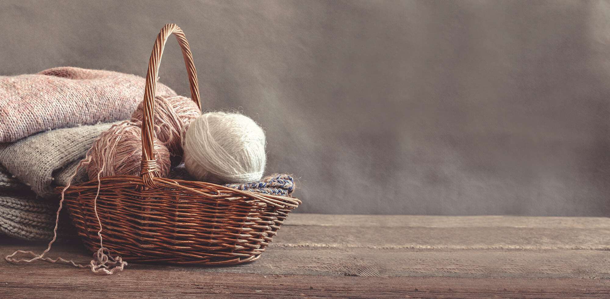
Or go through your own stash at home. It can be a treasure trove for new ideas.
Whether at home or in a shop, lay the skeins next to each other (in good daylight!) to match them up. Swatches are even better. Or wrap a few centimeters of each color around a piece of cardboard or a ruler. This is often more helpful than just looking at the skeins
Choosing Yarns Online
When shopping online, it’s smart to stay within one brand or yarn line because the colors are usually designed to coordinate.
Take Balayage by Pascuali. The shades are designed for both subtle tonal pairings and striking but harmonious contrasts.
Pascuali yarns are also designed to work well across ranges, e.g., combined with Mohair Bliss or Manada as carry-alongs.
A Quick Detour: Shades, Temperatures, and Contrasts
Remember when we talked about the impact of the main colors: red, yellow, blue, and green, plus black and white? Well, of course, they rarely show up in their purest form. Add a little white and suddenly you’ve got soft pastels. Add black, and they become richer, deeper, more muted.

Yellow tones bring warmth, while blue cools things down. That’s something to keep in mind when you’re mixing colors. Staying within the “warm” or the “cool” family usually gives you a harmonious vibe. Mix the two? That can be exciting and bold, but also a bit tricky, because it might end up looking too busy.
And here’s a neat little trick: if you’re not sure whether your colors have enough contrast, just snap a quick photo of your yarn and switch it to black-and-white mode. If everything blurs together, your contrasts probably aren’t strong enough.
Color Combinations – New and Timeless

Many people hesitate to choose bold or unusual color combinations. Pink and orange together? Green and blue? Orange and blue? Absolutely! You decide what you like best! Bright color combos in cheerful tones are very trendy right now.
And then there are the classics, like blue, white, and red for a nautical touch. Gray and mustard yellow make a perfect combination for a Scandinavian-inspired look. Natural tones like beige and brown paired with olive green create an earthy, calm — and timeless — feel.
One more tip on how to make colors pop or tone them down: Try combining two or three different colors with white first, and then with black. When paired with white, colors appear more vibrant and luminous. The same colors become instantly more subdued when black is added!
Different Color Effects in Knitting and Crochet
Did you know the same color combination can look completely different depending on whether it’s knitted or crocheted?
Knitting usually creates smooth, flowing surfaces where colors blend softly and transitions appear gentle. Crochet, on the other hand, tends to have a more defined structure because the stitches are raised, with edges and textures that make colors pop much more strongly.
For example, a red-and-blue granny square in crochet can look bold and striking, while the same colors in a knitted stripe pattern might feel calmer and more subdued.
Conclusion
Finding the perfect color combo isn’t about a magic formula, and the best part is, there are no rules holding you back. In the end, it’s not about whether a combination is objectively “right” or “wrong.”

What matters is the joy you feel as you watch your stitches grow in the colors you’ve chosen.
Think of color pairing less as a science and more as an invitation to play and experiment. A little theory can help guide you, but your instinct and creativity are the most important tools you have. Lay your skeins side by side, try things out, mix them up, and most importantly, have fun with it!
👉 Now we’d love to hear from you: Which color combination has surprised you most recently, whether in a wonderful way or in a “never again!” kind of way?
Which Pascuali colors and combinations are your favorites?

1 comment
Susanne
Mir gefällt z.B. die Kombi Hellblau-Grau mit Orange 😊
Mein Tip zum Farbpairing online:
Ich „schmeiss“ mal alle in Frage kommenden Farben in den Warenkorb und lösche dann die unpassenden raus .
Mir gefällt z.B. die Kombi Hellblau-Grau mit Orange 😊
Mein Tip zum Farbpairing online:
Ich „schmeiss“ mal alle in Frage kommenden Farben in den Warenkorb und lösche dann die unpassenden raus .